Tuesday, 17 November 2009

Friday, 13 November 2009

Ratings.

The BBFC's Guidelines state that strong language like f*** etc, has to be uncommon at '12' or '12A' - puns on strong language is allowed. Moderate language like 'bitch' and 'twat' are allowed.

In our film the moderate language will probably be used, to refer to the other characters, or the groups will use them jokingly with each other.

For example - That tanorexic is such a bitch.

At '12' and '12A' moderate violence is allowed but it cannot be too detailed. They should be no gory moments.

There could be a fight between the chavs and emos.


Dangerous behaviour (for example hanging, suicide and self-harming) may be present in ‘12’ or ‘12A’ works but will not dwell on detail which could be copied or present those activities as pain or harm free. Weapons should not be glamorised in ‘12A’ and ‘12’ works. Discriminatory behaviour should not be endorsed by the film as a whole.

There may be infrequent sight of drugs misuse in a ‘12’ or a ‘12A’ but the portrayal should not be glamorised or provide instructional details.


Because of the social groups there may be self-harm/suicidal behavior present because bullying and stereotypical opinions will be used through out the film.

Chavs may carry knuckledusters but wouldn't put them to use.

There is a mention to drugs in the 'Scene kids' scenes but there will only be mentions not actual scenes.

Wednesday, 11 November 2009

1: In what ways does your media product use, develop or challenge forms and conventions of real media products?

The Title of the Film.
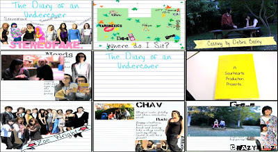
The title of our film is displayed in the first frame. It is produced on lined paper, just like the rest of the opening, to keep in relation to the scrapbook atmosphere. 'The Diary of an Undercover' is written in "Hannah's Messy Handwriting" in a blue font colour; 'Stereofake' is written in a bubblegum pink font colour with "Alpha Fridge Magnet". The line up of stereotypes is on the page with doodles on them and slight adjustments to make it look as though they have been drawn over.

This is fairly common to see this style of titles in "chick flicks" connected with college/school life. For example St Trinians. This has the whole doodle effect; however the doodles and titles are on walls not lined paper.
Mean Girls also has the two colour effect. 'Mean' in white and Girls in pink; this happens with all of their titles.

On the other hand, Angus, Thongs and Perfect Snogging has the same connotation with the girly font, but is displayed to the right of the screen while Georgia is running.

(click on the links to see the frame of the title of the film)

Therefore this genre of film has two different styles of showing the film title on screen.

Setting/Location.
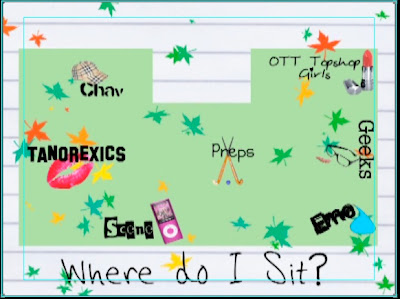
The reason why I've chosen the map as my setting/location shot is because it gives off the whole school/college cliche atmosphere. I could've easily used a live footage scene but they do not give the right feeling, compared to the map. Maps are not very popular in films, therefore it is unusual to see it appear in this film opening. However Mean Girls uses the map to define seating areas and to introduce the groups. Click here to see the map.
Even though we both use this map idea they are presented in two different ways. Ours is much more simple and is created by photoshop. Theirs is hand drawn with the cafeteria and outside area.

Costumes and Props.
Every film has costumes and props, therefore this is a typical media convention. In our frame you can see two 'Emo' girls sitting on a bench. The bench is the prop. Hannah is in a black vest, tights and tutu. Yasmin is in a red&black stripy jumper, black skirt and black tights - that is the costume. Many films from this genre, like us, rely on the costumes and props to separate the characters and to show journeys etc. For example, Cady from Mean Girls.

Camerawork and Editing.
This frame shows the transition between scrapbook and live footage. There is a still on every scrapbook page so that we could edit a smooth transition between scrapbook and live footage.
The reason I chose this as camerawork and editing is because we only used a range of shots, not zooms etc, because we wanted to keep out shots as simple as possible, and not to confuse the viewer. Therefore this shows the camerawork and editing.

Title font and Style.
This frame is from the first part of the title of the film. The title is split into two parts - the diary of an undercover; and, stereofake (with the lineup behind).
The font used is "Hannah's Messy Handwriting" which is used in all of the titles.
Girly/ Journal styled handwriting is a key element in this type of film; as shown above in 'the title of the film'.

Story and how the opening sets it up.
I have used the first shot we see for this frame because it sets the story up. We are shown a book and the camera then enters the book. This sets the story up because it shows we have gone into the book and the following clips are inside the book.
This is more common with fairytales/ disney films.


Genre and How the Opening Suggests it.
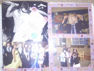
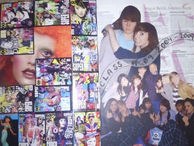
For this frame I have used one of the memory scrapbook pages. It shows a picture of a group at prom and 3 girl (best friends) with a girly banner with a name in it. This shows the genre because most girls have collages or photos on their walls, with all their best memories and friends; so when they look at this they'll think they've seen it at their house or a best friends house.
Wall Collage: 1 - 2 - 3
However wall collages are more for the audience to connect with, not to link to other films.

How Characters are Introduced.
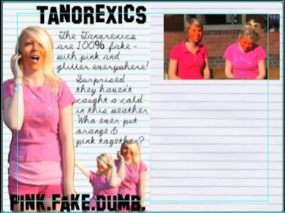
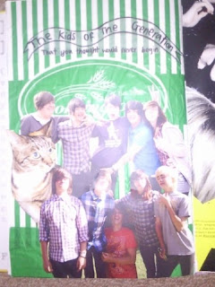
This shows how every character is introduced, but in this frame its just the 'Chavs'. There is a big picture of the main character of the stereotype; followed by a few little pictures surrounding them; the stereotype title in a font that represents that group; and, a little bit about the group filling in the space. On the other page there is a still which the live footage connects to. This is a good way to introduce characters. In St Trinian's they are introduced in a similar way - the head girl takes Annabelle through the dorm and says something about the group and then the shot freezes and the group name appears in a certain font. Chav.

Special FX.
We didn't use any special fx so for this frame I used the transition of Scene kid page to the live footage. I class this as a special fx because we zoomed into the still which then starts moving. We also brightened the live footage.
This is not very common. Special FX is like Star Wars and green screen etc - which is very common in sci-fi/ action films, not "chick flicks" etc.


Tuesday, 10 November 2009

2: How does your media product represent particular social groups?

Emma "Tanorexic" & House Bunny

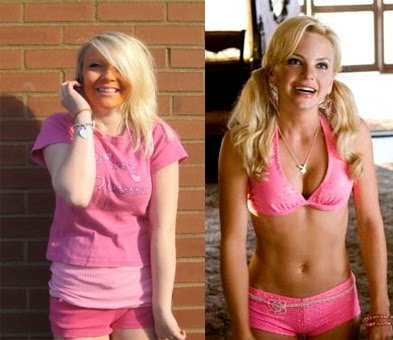
We decided to choose emma for the role of the tanorexic as she is a naturally giggly girl, and has blonde hair which fit the stereotype of a tanorexic. We got this idea from the girl from 'House Bunny' as she has the same stereotypical qualities.
They are both blonde, love pink and very giggly and ditsy.
Emma is practically the younger version of the House Bunny.
Ours is a lot more exaggerated, for comic reasons, hence the orange face paint; emma is also not an ex playboy bunny in our film, just playing a really blonde, self obsessed girl.
They both wear hardly anything, and what ever they do wear is pink & glittery.

Monday, 9 November 2009

3: What kind of media institution might distribute your media product and why?


Tilly: I found a photo I liked on photobucket, and it really caught by eye, so i decided to base my production logo on this. I chose to call it 'Colour Flash' because it fits with the image, and 'Flash' also refers to films etc.

Yasmin: I saw a picture on the internet that had the whole collaborated background with an envelope over the top; so i decided to create my own collaborate background but put a polaroid over the top. 'Sour Hearts' was a pun of sweetheart and it also sounds quite edgy and rememberable.

T: A production company creates ideas and motion pictures, tv programmes, and adverts etc - they may also find funding for the products they produce. Paramount have produced Angus, Thongs and Perfect Snogging & Mean girls.

Y: A distributor is someone reliable who would get the film out there and support it fully. Paramount Pictures would be the most reliable - they've been going for years and have already got films being produced for 2013.

T: The money could come from the National Lottery - Uk Film Council. They have funded St Trinian's and Kidulthood who have influenced us hugely.

Y: The production companies are written outside of the book. The three main actors are written on banners, name tags and masking tape. The rest of the main cast is on a 'Class 09' page. Costume design to Original Music is also written on tape to keep to scrapbook theme. Producer and Director written outside of the book. It all keeps to a scrapbook theme.

T: Our film influences are St Trinian's; Clueless; Angus, thongs & Perfect Snogging; Mean Girls; Skins; House bunny; and, Kidulthood.

Sunday, 8 November 2009

Who would be the audience for your media product?


This is Shanelle Goodwin. She is 15 years and 7 months old, and lives in the suburbs of Leeds.
she dresses fairly straight forwardly - just jeans and a top. She enjoys sleepovers with her friends, and shopping at the weekends with her pocket money. She shops in places like H&M and River Island, Jane Norman, New Look, and Topshop.
She enjoys films like Mean Girls, Angus Thongs and Perfect Snogging, House Bunny, St Trinians, Sex and the City, Mumma Mia, she enjoys watching them at the cinema and also buying them later on DVD and watching them with her friends, and jelly and icecream.
They would watch Hollyoaks, Friends, Scrubs, Family Guy, X Factor, America's Next Top Model, One Tree Hill. The main channels would be Channel 4; E4; Living Tv; ITV; BBC Three; Comedy Central.
The music this girl would listen to would be anything in the charts, varying from pop, hiphop. r 'n' b, indie music - not really a 'rock' or 'classical' or 'dub-step'. Listens to Kiss FM and Radio 1 for the 'chart hits'.
I think our film would appeal to this girl as she is a stereotypical girly girl who enjoys typical girly things, therefore, if this film was shown at her local cinema, this may appeal to her, as it's similar to other films she likes, such as Mean Girls, House Bunny, and Angus Thongs and Perfect Snogging and St Trinians.

Friday, 6 November 2009

What have you learnt about technologies from the process of constructing this product?
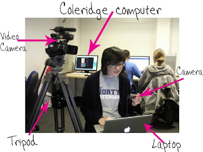
The Coleridge computer's had a lot more programmes than we've used before.
Video Camera was pretty simple to use, especially with the tripod.

Final cut was the main programme we used. We learnt how to fade in/out; transitions; how to build up our editing skills; adding sound; importing clips from the video camera; and also arranging clips etc.


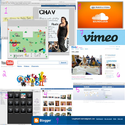
1- Photoshop
We made credits; the map and the stereotype profiles from this.
2- Google
We found images and sites from this.
3- itunes
We imported music via this.
4- facebook photos
We uploaded photos to this so we could access them from anywhere.
5- Facebook
We contacted each other via this.
6- Flickr
We uploaded our work/ timelines etc from this.
7- Vimeo
Our final/rough cuts, animatics and idents were uploaded to this.
8- Soundcloud
We uploaded our music to this - with garage band
9- Blogger
Where all our work/ planning is.
10- Garage band (we forgot to put the image on)
To help edit the soundtrack and for a tutorial as well.


We used this website (SBBFC.COM) to work at the guideline/rating for our film.

Thursday, 5 November 2009

Looking back at your preliminary task (the continuity editing task), what do you feel you have learnt in the progression from it to full product?
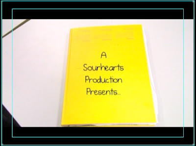
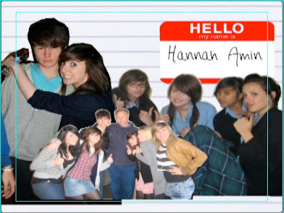
To be honest we don't have any of the preliminary tasks within our film opening because of the structure we've used.
If the film was continued, surely these tasks would be present.
The reason why these rules aren't present in our opening because, the nature of our opening doesn't need them; for example, we go from animated scrapbook, to the birds eye view of the map, to the profile pages of the stereotypes, and then to the live footage which is just a stationary shot (long/ midshot/ close up). It ends with the book closing, to show that we are not inside the diary anymore.
However, it is continuity task because it starts with the book opening and then ends with the book closing.


Wednesday, 4 November 2009

Creative Risks

Risk: We could've potentially offended people with the stereotypes. 
Cost: People wouldn't appreciate the film opening because it's offensive. 
Benefit: The stereotypes were extreme and exaggerated, so hopefully it's more comical than offense/serious.

Risk: The costumes weren't specific.
Cost: The group footage could've looked really bad because the outfits clashed/didn't work. 
Benefit: The outfits really worked because the outline was really basic but we talked it over during lessons and facebook/text etc. 

Sunday, 1 November 2009

Feedback From Tom H/Louis

I really appreciate the criticism from tom and louis especially because everything they said was true.
The reason why the stills aren't long enough for people to read, is because there needs to be a voice over, explaining the groups.
We just needed the visuals of a scrapbook; we rushed our rough cut, to produce something on time.

Because the stills only take up half of the screen, we'll take a screen shot of the opening frame of the motion visuals, edit it into the other side of the screen and then cross dissolve them to get the transitions.

We have all of the titles, we just need to finish the project to put them on.

Tuesday, 27 October 2009

Plan For Next Week.

Monday - Work on the animated Scrapbook/ Soundtrack

Tuesday - Edit the visuals - Soundtrack (Afternoon).
- maybe film the scrapbook turning pages etc

Wednesday - Tutorial - Talk to nick about the animated scrapbook

Thursday - Animated Scrapbook/Soundtrack

Friday - Finish the final project.

Feedback for Tom & Louis

L3 - GROUP 9 (Tom H & Louis) Film Opening Rough Cut from cmdiploma on Vimeo.
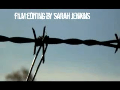

I rate the use of location as their strength because it has a really urban and grimy atmosphere and builds a lot of tension and mood. I especially like the use of close ups - like the barbed wire shot.

If I'm being honest, I think their opening is absolutely amazing - there's not much i can fault. If I had to point out one thing it would be, to make their match on action shots a little neater, so it flows much more smoother.

They don't need to change anything, except the match on action shots flowing smoother.

The still need to make the overall project look more professional, because they have all of the titles, soundtrack/backing track and a variety of shots.

Rough Cut

L3 - GROUP 8 (Yasmin & Tilly) Film Opening Rough Cut from cmdiploma on Vimeo.


This is our rough cut. It is no where near finished because of the schedule we had to work around - it was no body's fault, because we were only at coleridge for a total of about 12 hours, where we needed to do several costume changes; find perfect lighting because our camera messed up; location scouting; editing and music producing.
Hannah and Emma missed the first two periods on he friday of shooting because they had to shoot their own film opening.
So Nick taught us how to make an animated scrapbook and talked to us about our music.

The first part of our film opening is not on our rough cut. The music behind it is also not our own and we will be creating some over half term.

Despite the time we had I feel as though this is a good start, and the only way to go is up from this point.

Monday, 19 October 2009

Explaining our "Perfect Moment" during filming.
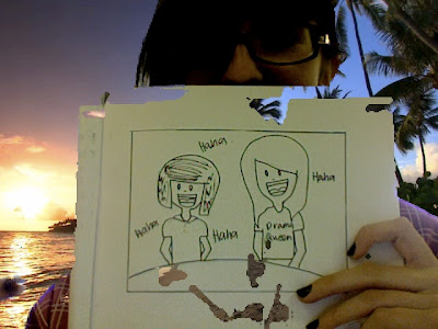


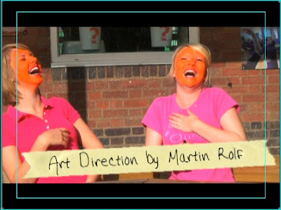
This was my perfect moment because at first we had no idea how the 'Tanorexics' would act.
We had the camera rolling as I talked to Tilly and Emma. At last we decided they would act really giggly and ditzy. Emma and Tilly looked at each other and just burst out laughing; we had about two minutes of footage of them genuinely laughing uncontrollably. It looked so good.
That is why it was my perfect moment of filming because an original outtake/blooper turned into actual good usable footage.

Weather For Filming.

We needed to know what the weather is like for tomorrow because we are due to finish shooting - Topshop Girls & Geeks.


It seems to be okay; especially as the rest of our footage is sunny.

The Original Music

This is the original music we wanted for the soundtrack :


This is the original Lily Allen song; it's happy and upbeat.

However we were going to use the instrumental of this song.
Have a listen here?

Soundtrack Tester.


This is our test for creating a soundtrack.
It didn't take too long but this is not the soundtrack that I wanted to use underneath our footage, purely because it builds the wrong atmosphere.

Friday, 16 October 2009

this is our animated test for the scrap book.

Thursday, 15 October 2009

Weather For Filming.


Tomorrow morning the weather is grey and horrible. Luckily we aren't shooting until 12ish onwards, because of our extras, and the weather is sunny and lighting will be better.

Title Sequence.

A Sour Hearts Production 
A Colour Flash Production Film
Emma Smart - Main
Hannah Amin - Main 
Zoe Wright - Main
Lola Murr - minor
Daisy Cole - minor
Max Phillips - minor
Josh King - minor 
Ben Morris - minor

Costume Design by Marilyn Williams
Art Direction by Martin Rolf
Production Design by Sarah Johnson
Casting by Debra Bailey
Film Editing by Phillip Hyne
Cinematography by Rose Smart
Original Music by Hans Zimmer
Produced by Yasmin Murr
Directed by Tilly Wright 


The First Pictures:
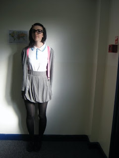
This is Yasmin (Myself). I am playing the main "Geek" in the film opening. 
I am wearing a polo shirt; high waisted skirt; grey cardigan; braces; tights; black plimpsoles.
Hair and Makeup: Straight hair, fringe clipped back; nude makeup - with blusher; geek glasses.


This is Tilly (who is also producing our film opening). She is playing the "Preppy" girl.
She is wearing a blue jumper; with white skinnies; and white plimpsoles.
Hair and Makeup: straight hair with fringe clipped back; nude complexion and makeup.


This is Hannah. She is playing her alter-ego - the main "Emo" girl. 
She is wearing black vest; black tutu; tights; high knee black socks/purple stars; plimpsoles.
Hair and Makeup: Long black/brown hair; red lips; buckets of black eyeliner.


I am also playing the main "Scene Kid". 
I am wearing skinny jeans; I Heart NY shirt; Hello Kitty Hoodie; and black plimpsoles.
Hair and Makeup: bright pink eyeshadow round the eyes; purple eyeliner; hair tied up, backcombed a little bit.


Tilly is also playing the main "Over the top Topshop Girl".
She is wearing a gorgeous dress, with red heels - a bit too dressy for college (hence the OTT part). 
Hair and Makeup: straight blonde hair, with pale complexion, eyeliner and red lips.

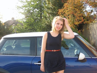
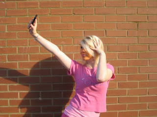
This is Emma who is playing the main 'Tanorexic" in our opening film.
She is wearing pink hot pants; pink vest top; pink 'drama queen' top; high knee socks; and uggs.
Hair and Makeup: straight, blonde hair with orange face, loads of eyeliner and pink lips.

This is Hannah, who is playing the main 'Chav' of our opening. 
She is wearing tracksuit bottoms; black vest top; and plimpsoles. 
The hair and make up: side pony tail with lots of foundation and bronzer, but with concealer on the lips, making her lips lighter than her complexion. 


Wednesday, 14 October 2009

The Pitch.

This is the story of a teenage girl who had to be moved away from everything she's every loved because her dad got offered a new job. The only memories she has is through her scrapbook/ journal. Starting a new college she has no friends. She looks around and thinks could she fit in with ANY of these groups.
Taking a close look at all the groups she puts their profiles in to her scrapbook.
She makes a map of the lunch/group seating plans and goes through each stereotype making comments about each group.

Through out the film she gets into each stereotype but one by one she leaves because it doesn't feel right.

She is always adding bits to her journal about what the groups say about each other behind their backs.

She ends up with the prep/ jocks.

Everything starts to get back to normal. but then they preps find her journal and all the mean things she's said about the other groups - they find it funny, until they see they're pages and find out all the comments she's made and what the other groups have said in the journal.

Que the main girl as an outcast and starting all over again. She becomes upset and stays home all the time.
She is eventually excepted by a close friend on the performing art team and she becomes a member of their group.

All the groups live in harmony again once the main girl send letters to all the groups at the end of the two years.

Film Opening - Girl flipping through the journal, looking at old photos/memories. There is a voice over explain what the girl is looking at. She homes in on the map and talks through the different social groups. There is a Chav profile and then it turns into live footage of the chavs. This happens to all of the other groups too.

The Brothers Bloom Animatic.

Brothers Bloom Childhood Sequence Animatic from rcjohnso on Vimeo.


Rian's animatic is absolutely incredible! The detail put into this storyboard is just amazing; the drawing, the setting detail and the detail in the script! Next time I take on an animatic I want to do it like this, with close ups in the shots etc.

Look at how similar they both are - hopefully my storyboard will compliment the real opening we'll produce.

There are some more shots added/ interpreted in the actual video. But watch the animatic and then watching the real one was actually mental to see that it was exactly how Rian envisioned it.

Stupid Girls - P!nk Music Video Influence


This definitely is an inspiration for our film opening because of how the girls act in the music video.
P!nk deals with a massive dilemma, and speaks the truth about how girls want to grow up, nowadays.
This is how the "Tanorexics", "Topshop Girls" and the main girl should act like "P!nk" in this because she really doesn't fit in but tries so hard.

Two-in-one: Mean Girls vs Stupid Girls.

All of our Media Influences:

St Trinians.
Clueless.
Angus, Thongs and Perfect Snogging.
Inbetweeners.
This is England.
Mean Girls.
House Bunny.
Gossip Girl.
Ugly Betty.
Skins.
Kidulthood/Adulthood.
Pretty in Pink.
She's All That.
Waterloo Road.
Superbad.
Napoleon Dynamite.
The Hills / My Super Sweet 16.
Stupid Girls - P!nk

Mean Girls Opening - Film Influence


Mean girls was a huge success with the teenage generation and I have never met a girl OR boy who isn't in love with this film!
It has everything: fashion; music; comedy; high school; bitchiness; fighting; and endless pranks being played on each other.

This is a big inspiration because of the divide between the girls and because of the carefree college/ high school life.

St Trinians Opening.

St Trinian's has to be our biggest inspiration purely because of the setting, social groups and the way it is shot.
The titles to this film really relate to how we want ours - doodles; Britain's Banksy graffiti; colour; and the way it is being presented.

The music is an upbeat instrumental (like ours is) and at the end of the film (St Trinian's) the instrumental is turned into a live performance, by girl, pop band Girls Aloud - who are popular with the age group this film was aimed out.

We have chosen a Lily Allen instrumental for our title sequence because Lily Allen is really successful with teenagers; she also is super fashionable and her music is well known.

Angus, Thongs, and Perfect Snogging - Film Influences


Angus, Thongs, and Perfect Snogging is a really sweet opening to a film. We find out about her parents, friends and where she lives.
Her family are caring but do not understand Georgia's personality.
Her friends love her but they aren't always there for her.
Her town is a lovely, colourful, seaside town - but it's no Brighton.

This relates to my film because of the age group it's aimed at.
Teenagers interested in our film, would also be interested in the Georgia Nicholson saga and film, and understand the language used in this film. Also the music used in this film was a massive success at the age group it was aimed at.

Monday, 12 October 2009

Forward Planning.
Tomorrow we are having a photoshoot to make the journal.
It should be a good chance to get most of the work done, and even some footage.

Here are some images of the scrap book so far:
These are for the old memories.

Shot List.

Shot 1 - Point of View - Coleridge Classroom - Diary Front

Shot 2 - Point of View - Coleridge Classroom - Inside Diary

Shot 3 - Point of View - Coleridge Classroom - Inside Diary

Shot 4 - Point of View - Coleridge Classroom - Inside Diary

Shot 5 - Close Up - Coleridge Classroom - Main Title

Shot 6 - Close Up - Coleridge Classroom - Map/ seating plan

Shot 7 - Point of View - Coleridge Classroom - Chav page.

Shot 8 - Long Shot - Live Footage of Chavs

Shot 9 - Point of View - Coleridge Classroom - Tanorexic Page

Shot 10 - Long Shot - Live Footage of Tanorexics

Shot 11-Point of View - Coleridge Classroom - Scene Page

Shot 12- Long Shot - Live Footage of Scene Kids

Shot 13-Point of View - Coleridge Classroom - Emo Page

Shot 14- Long Shot - Outside Coleridge - Live Footage of Emos

Shot 15- Point of View - Coleridge Classroom - Geek Page

Shot 16- Long Shot - Outside Coleridge - Live Footage of Geek

Shot 17-Point of View - Coleridge Classroom - Over The Top Topshop Girls Page

Shot 18- Long Shot - Outside Coleridge - Live Footage of Topshop Girls

Shot 19- Point of View - Coleridge Classroom - Jocks Page

Shot 20- Point of View - Outside Coleridge - Live Footage of Jocks

Shot 21- Close Up - Coleridge Classroom - Book Slams Shut

Shot 22- Long Shot - Outside Coleridge - The Eight leaders.

Sunday, 11 October 2009

Feedback

More excellent work this week!

Diary Of An Undercover Stereofake - animatic

L3 Group 8: YASMIN & TILLY - OPENING SEQUENCE ANIMATIC from cmdiploma on Vimeo.

Creating Opening Sequence Storyboards.
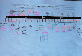
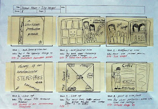
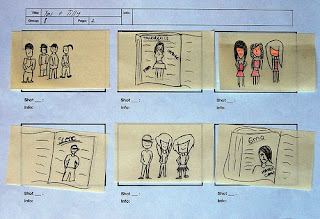
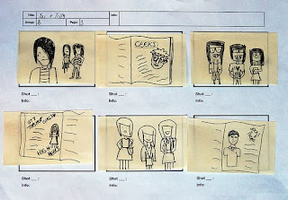
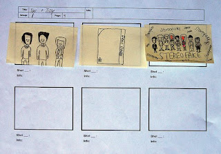
This is our timeline. Overall we had enough shots to last for two minutes. Most of the shots are of the different stereotypes in the journal/diary. Below is us working on the post-it notes.


Above is the first six frames of our opening sequence. It starts with the diary opening, then flicking through the pages, full of old photos; then the main title is displayed in the journal; then the map is displayed and it homes in on the "CHAV" section, turning into the "CHAV" page. 
The next six shots are of live footage; tanorexic journal page; live footage; scene journal page; live footage; then the emo page. 
Next is live footage with the "emos"; then the geek page; live footage; the over the top Topshop girls; live footage and then the Jocks page. 
These are the last three "main" shots of the opening: live footage; diary shut; the end image of all the groups.


This is Tilly & I working on our storyboard and timeline.


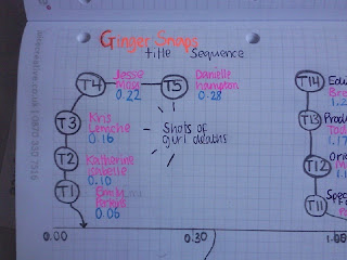
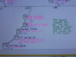
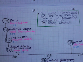
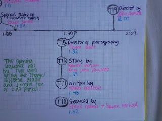
Ginger Snaps Timeline.


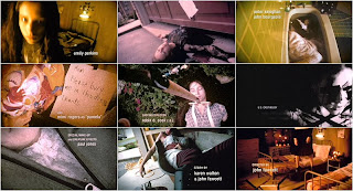
Ginger Snaps is one of my favourite films, therefore when I saw the 9-grid photo on the 'Art of the Title' I knew it would be an interesting title sequence to do.
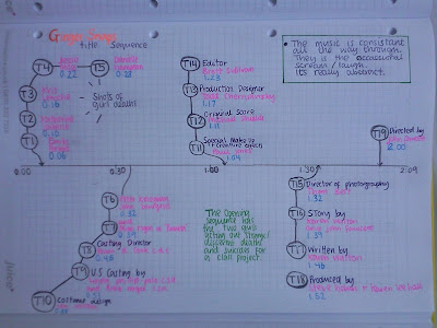
This task helped me a lot with understanding title sequences. They all followed the same pattern (time-wise) and appeared on the screen in the same style - blurred, to clear. 
The titles were a white, clear font; easy to read and see. Their timing was good and had enough time for the audience to read. 
Below are some close-ups of my timeline, so you can see all the different cast& crew involved. 
(The format goes: title number; job; name; time)


Watch the full title sequence here: Ginger Snaps title sequence.

Tuesday, 6 October 2009

Title Sequence - grid
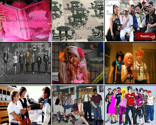
Grid 1 - The journal - a Sour Hearts Productions presents.
Grid 2 - Canteen/lunch area - a Colour Flash Production film.
Grid 3 - chav group - Costume by Marilyn Williams
Grid 4 - Emo group - Production design by Sarah Johnson
Grid 5 - Tanorexic - Casting by Debra Bailey
Grid 6 - Scene group - Cinematography by Rose Smart
Grid 7 - Jocks/preps - Original Music by Hans Zimmer
Grid 8 - Geeks - Produced by Yasmin Murr
Grid 9 - Main leader from every group - Main Title


This task was really fun. I had to find random images from the internet, flickr and my previous moodboard and patch them together to make the opening of my film.
This is not the entire opening but nine different clips, that will be connected together by a series of other clips.

Our Pitch - Independent category

We decided to use elements from both of our films to create our pitch.

This is a story produced though the eyes of a normal girl and her journal, about her life at college.
Her journal describes the different social groups she faces at college. including: chavs; tanorexics; preps/jocks; over the top topshop girls; geeks; scene kids; emos, and; the normals (her group).
The story is mostly voice over, but there is also a lot of dialogue between the different clashing groups.

The journal is a key element in the opening. There'll be pictures of the different groups and writing about them as the girl flicks through the journal. Close ups of the journal and character pictures, turn into real life footage of the people, at college.

The opening closes with a group shot of the leader of each group, doing a signature stereotype gesture. For example:
Chav - swearing
Geek - adjusting glasses
tanorexics - looking in mirror
emo - hair flick
scene - over the top pose
prep/jock - holding cricket bat/ rugby ball etc
Topshop girl - adjusting skirt/ dress
Normal - Girl with journal (middle)

My Final Ident.

L3 YASMIN-IDENT_FINAL from cmdiploma on Vimeo.

This is my ident. My ident is the most colourful, compared to everyone else's; so I'm not sure if mine looks professional enough.

Making this ident was quite interesting, but was annoying at times when the transitions didn't move at the same time etc. Overall I believe my ident is fairly rememberable.

Sunday, 4 October 2009

Feedback

Very good ! your blog looks ace!

Saturday, 3 October 2009

My Short Film Pitches.

A mainstream action film that will appeal to 15-25 year old males.

When experimen 98210, Jake Fisher, escaped from the lab, little did he know what they had done to him. Watch as a man has to fight his way back to the top, with his new electrical powers, to try and change the justice of the other experiments.


A supernatural thriller that will appeal to female audiences.

A widow, Jane Meadows, and her two children, agree to house sit for their sick mother-in-law while she is taken to a hospital, to start treatment out of town. Going through old boxes in the attic, she realises that her mother in law had a lot more children, who also "suspiciously" died. A night of paranormal antics leaves Jane asking were the deaths accidental?


An independent movie featuring a young protagonist.

Pregnant in the 1980's growing up in the world of Skinheads, and racial warfare. How will 15 year old pregnant, Sally, be able to cope with her dad in the Falklands, depressed mother, and the father of her baby, being taken into the skinhead ways.


An animated feature that will appeal to adult audiences.

A manic depressive, OCD man looks for counseling but ends up in the loud and live world of sex, drugs and rock 'n' roll. With his unhealthy lifestyle killing his brain, and ends up spiraling out of control, pushing him to overdose.

Friday, 2 October 2009

Credits For Opening Sequence

A Sour Hearts Production presents
A Colour Flash Production film

(cast) Helen Smith
(cast) John Brown
(cast) Zoe Wright

Costume Design by Marilyn Williams
Art Direction by Martin Rolf
Production Design by Sarah Johnson
Casting by Debra Bailey
Film Editing by Phillip Hyne
Cinematography by Rose Smart
Original Music by Hans Zimmer
Produced by Yasmin Murr
Directed by Tilly Wright 

Main Title

Research - St. Trinian's Makeover


St Trinian's was one of our main inspirations because of the divide between the girls at the school.
Our film is set in a college, therefore the divide is still present. 
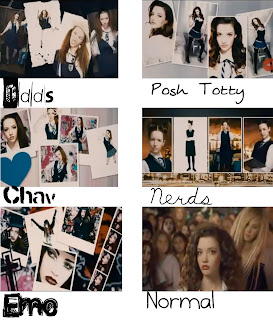
During the makeover scene, (screen shots to left), each stereotype takes it in turns to fit, the new girl Annabelle Fritton, to give her a makeover. 
Odds are the year 7s. They're really crazy and messy. 
We used the font 'Black Casper' for the Odds because the writing is all different. It fits their stereotype well. 

Posh Totty are posh, stuck up and clueless. The dress more subtle than slaggish, but they do reveal a lot. The font we used was 'Julie' which is an inspired from a girly journal style of font. 

The chavs are rude and confrontational. The dress with lots of accessories and makeup. They have a lot of attitude. The font is "Urbana" - it resembles spray paint.

The nerds look like something from Hogwarts. They are properly covered up with long skirts. The font was "My First F" - it's really neat and suits the stereotype. 

The emo's are depressed, and also cake on the makeup, but not like the chavs. They wear tons of eyeliner and black clothes. The font is distressed, it looks as though they have drawn it themselves. 

The final result is Normal. She has inspiration from all groups, but overall she is unique; she also takes after head-girl Kelly. The font we used was "Burst My Bubble".

Thursday, 1 October 2009

My Video Production Logo
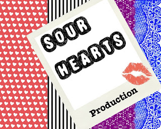


This is my production logo. I got my main inspiration from an Alice in Wonderland, Queen of Hearts, image. 
I chose the different stripes because i liked the clashing style, and to represent the variety the production company can offer. 
I used a polaroid collaboration, displaying the production company name - "Sour Hearts"; in the font "Truffle-Shuffle", because I liked the edginess of the text, and it is memorable. 
The word "production", is in a typewriter font. I don't know why I chose it but I think it's quite effective. 
The kiss mark was the final touch. I used the kiss mark, because it relates to the title. It also adds a feminine feel to the overall logo. 
I chose the production name from the common phrase "sweethearts". I thought "sweethearts production" sounded too corny, and girly; so i added a twist to add a lot of effectiveness and edginess. 

Wednesday, 30 September 2009

Preliminary Exercise.

Continuity editing is editing film/shots so that they seem to flow uninterrupted, from shot to shot. They can also include 'cross-cutting', where a scene cuts between two different settings where action is taking place at the same time, to make the same scene, in the final product. 

The 180 Degree Rule.

The 180 degree rule, is a basic guideline, that states that two characters/elements in the same scene should always have the same right/left relationship to each other; for example, if the camera passes over the imaginary line, it becomes a reverse angle, making the scene look odd. If the camera is filming over the left should of one character, it would have to film over the other character's right shoulder, to make the scene look ordinary. 


The Match on Action. 

The shot was quite difficult to achieve, because you had to have the timing precise, otherwise the door would be opening twice. 

Match on action is to connect two shots cut together by having a character finish an action in shot B begun in the shot A. For example: Shot A - close up of door handle, opening door. Shot B - Actor walking through door, mid shot. 


Shot/Reverse Shot.

The alternating of two shots to show interaction/conversation between to characters or objects in each shot; for example, shot A is speaking and shot B shows the character who he/she is speaking to.


Overall I think that Tom & I edited our preliminary well. I'm most proud of our Match on Action shot because it flows naturally. 

Rob captured all the scenes really well. Tom B and Tom H were helpful, and took direction good. I directed - I could've been more thoughtful with how the shots were placed, but overall i am proud with the final product.