Tuesday, 17 November 2009

Friday, 13 November 2009

Ratings.

The BBFC's Guidelines state that strong language like f*** etc, has to be uncommon at '12' or '12A' - puns on strong language is allowed. Moderate language like 'bitch' and 'twat' are allowed.

In our film the moderate language will probably be used, to refer to the other characters, or the groups will use them jokingly with each other.

For example - That tanorexic is such a bitch.

At '12' and '12A' moderate violence is allowed but it cannot be too detailed. They should be no gory moments.

There could be a fight between the chavs and emos.


Dangerous behaviour (for example hanging, suicide and self-harming) may be present in ‘12’ or ‘12A’ works but will not dwell on detail which could be copied or present those activities as pain or harm free. Weapons should not be glamorised in ‘12A’ and ‘12’ works. Discriminatory behaviour should not be endorsed by the film as a whole.

There may be infrequent sight of drugs misuse in a ‘12’ or a ‘12A’ but the portrayal should not be glamorised or provide instructional details.


Because of the social groups there may be self-harm/suicidal behavior present because bullying and stereotypical opinions will be used through out the film.

Chavs may carry knuckledusters but wouldn't put them to use.

There is a mention to drugs in the 'Scene kids' scenes but there will only be mentions not actual scenes.

Wednesday, 11 November 2009

1: In what ways does your media product use, develop or challenge forms and conventions of real media products?

The Title of the Film.
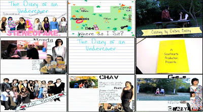
The title of our film is displayed in the first frame. It is produced on lined paper, just like the rest of the opening, to keep in relation to the scrapbook atmosphere. 'The Diary of an Undercover' is written in "Hannah's Messy Handwriting" in a blue font colour; 'Stereofake' is written in a bubblegum pink font colour with "Alpha Fridge Magnet". The line up of stereotypes is on the page with doodles on them and slight adjustments to make it look as though they have been drawn over.

This is fairly common to see this style of titles in "chick flicks" connected with college/school life. For example St Trinians. This has the whole doodle effect; however the doodles and titles are on walls not lined paper.
Mean Girls also has the two colour effect. 'Mean' in white and Girls in pink; this happens with all of their titles.

On the other hand, Angus, Thongs and Perfect Snogging has the same connotation with the girly font, but is displayed to the right of the screen while Georgia is running.

(click on the links to see the frame of the title of the film)

Therefore this genre of film has two different styles of showing the film title on screen.

Setting/Location.
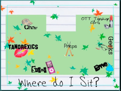
The reason why I've chosen the map as my setting/location shot is because it gives off the whole school/college cliche atmosphere. I could've easily used a live footage scene but they do not give the right feeling, compared to the map. Maps are not very popular in films, therefore it is unusual to see it appear in this film opening. However Mean Girls uses the map to define seating areas and to introduce the groups. Click here to see the map.
Even though we both use this map idea they are presented in two different ways. Ours is much more simple and is created by photoshop. Theirs is hand drawn with the cafeteria and outside area.

Costumes and Props.
Every film has costumes and props, therefore this is a typical media convention. In our frame you can see two 'Emo' girls sitting on a bench. The bench is the prop. Hannah is in a black vest, tights and tutu. Yasmin is in a red&black stripy jumper, black skirt and black tights - that is the costume. Many films from this genre, like us, rely on the costumes and props to separate the characters and to show journeys etc. For example, Cady from Mean Girls.

Camerawork and Editing.
This frame shows the transition between scrapbook and live footage. There is a still on every scrapbook page so that we could edit a smooth transition between scrapbook and live footage.
The reason I chose this as camerawork and editing is because we only used a range of shots, not zooms etc, because we wanted to keep out shots as simple as possible, and not to confuse the viewer. Therefore this shows the camerawork and editing.

Title font and Style.
This frame is from the first part of the title of the film. The title is split into two parts - the diary of an undercover; and, stereofake (with the lineup behind).
The font used is "Hannah's Messy Handwriting" which is used in all of the titles.
Girly/ Journal styled handwriting is a key element in this type of film; as shown above in 'the title of the film'.

Story and how the opening sets it up.
I have used the first shot we see for this frame because it sets the story up. We are shown a book and the camera then enters the book. This sets the story up because it shows we have gone into the book and the following clips are inside the book.
This is more common with fairytales/ disney films.


Genre and How the Opening Suggests it.
For this frame I have used one of the memory scrapbook pages. It shows a picture of a group at prom and 3 girl (best friends) with a girly banner with a name in it. This shows the genre because most girls have collages or photos on their walls, with all their best memories and friends; so when they look at this they'll think they've seen it at their house or a best friends house.
Wall Collage: 1 - 2 - 3
However wall collages are more for the audience to connect with, not to link to other films.

How Characters are Introduced.
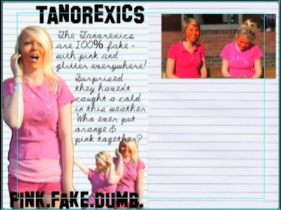
This shows how every character is introduced, but in this frame its just the 'Chavs'. There is a big picture of the main character of the stereotype; followed by a few little pictures surrounding them; the stereotype title in a font that represents that group; and, a little bit about the group filling in the space. On the other page there is a still which the live footage connects to. This is a good way to introduce characters. In St Trinian's they are introduced in a similar way - the head girl takes Annabelle through the dorm and says something about the group and then the shot freezes and the group name appears in a certain font. Chav.

Special FX.
We didn't use any special fx so for this frame I used the transition of Scene kid page to the live footage. I class this as a special fx because we zoomed into the still which then starts moving. We also brightened the live footage.
This is not very common. Special FX is like Star Wars and green screen etc - which is very common in sci-fi/ action films, not "chick flicks" etc.


Tuesday, 10 November 2009

2: How does your media product represent particular social groups?

Emma "Tanorexic" & House Bunny

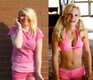
We decided to choose emma for the role of the tanorexic as she is a naturally giggly girl, and has blonde hair which fit the stereotype of a tanorexic. We got this idea from the girl from 'House Bunny' as she has the same stereotypical qualities.
They are both blonde, love pink and very giggly and ditsy.
Emma is practically the younger version of the House Bunny.
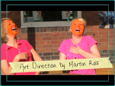
Ours is a lot more exaggerated, for comic reasons, hence the orange face paint; emma is also not an ex playboy bunny in our film, just playing a really blonde, self obsessed girl.
They both wear hardly anything, and what ever they do wear is pink & glittery.

Monday, 9 November 2009

3: What kind of media institution might distribute your media product and why?


Tilly: I found a photo I liked on photobucket, and it really caught by eye, so i decided to base my production logo on this. I chose to call it 'Colour Flash' because it fits with the image, and 'Flash' also refers to films etc.

Yasmin: I saw a picture on the internet that had the whole collaborated background with an envelope over the top; so i decided to create my own collaborate background but put a polaroid over the top. 'Sour Hearts' was a pun of sweetheart and it also sounds quite edgy and rememberable.

T: A production company creates ideas and motion pictures, tv programmes, and adverts etc - they may also find funding for the products they produce. Paramount have produced Angus, Thongs and Perfect Snogging & Mean girls.

Y: A distributor is someone reliable who would get the film out there and support it fully. Paramount Pictures would be the most reliable - they've been going for years and have already got films being produced for 2013.

T: The money could come from the National Lottery - Uk Film Council. They have funded St Trinian's and Kidulthood who have influenced us hugely.

Y: The production companies are written outside of the book. The three main actors are written on banners, name tags and masking tape. The rest of the main cast is on a 'Class 09' page. Costume design to Original Music is also written on tape to keep to scrapbook theme. Producer and Director written outside of the book. It all keeps to a scrapbook theme.

T: Our film influences are St Trinian's; Clueless; Angus, thongs & Perfect Snogging; Mean Girls; Skins; House bunny; and, Kidulthood.

Sunday, 8 November 2009

Who would be the audience for your media product?


This is Shanelle Goodwin. She is 15 years and 7 months old, and lives in the suburbs of Leeds.
she dresses fairly straight forwardly - just jeans and a top. She enjoys sleepovers with her friends, and shopping at the weekends with her pocket money. She shops in places like H&M and River Island, Jane Norman, New Look, and Topshop.
She enjoys films like Mean Girls, Angus Thongs and Perfect Snogging, House Bunny, St Trinians, Sex and the City, Mumma Mia, she enjoys watching them at the cinema and also buying them later on DVD and watching them with her friends, and jelly and icecream.
They would watch Hollyoaks, Friends, Scrubs, Family Guy, X Factor, America's Next Top Model, One Tree Hill. The main channels would be Channel 4; E4; Living Tv; ITV; BBC Three; Comedy Central.
The music this girl would listen to would be anything in the charts, varying from pop, hiphop. r 'n' b, indie music - not really a 'rock' or 'classical' or 'dub-step'. Listens to Kiss FM and Radio 1 for the 'chart hits'.
I think our film would appeal to this girl as she is a stereotypical girly girl who enjoys typical girly things, therefore, if this film was shown at her local cinema, this may appeal to her, as it's similar to other films she likes, such as Mean Girls, House Bunny, and Angus Thongs and Perfect Snogging and St Trinians.

Friday, 6 November 2009

What have you learnt about technologies from the process of constructing this product?
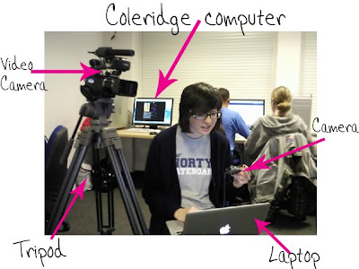
The Coleridge computer's had a lot more programmes than we've used before.
Video Camera was pretty simple to use, especially with the tripod.

Final cut was the main programme we used. We learnt how to fade in/out; transitions; how to build up our editing skills; adding sound; importing clips from the video camera; and also arranging clips etc.


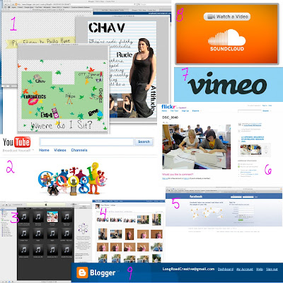
1- Photoshop
We made credits; the map and the stereotype profiles from this.
2- Google
We found images and sites from this.
3- itunes
We imported music via this.
4- facebook photos
We uploaded photos to this so we could access them from anywhere.
5- Facebook
We contacted each other via this.
6- Flickr
We uploaded our work/ timelines etc from this.
7- Vimeo
Our final/rough cuts, animatics and idents were uploaded to this.
8- Soundcloud
We uploaded our music to this - with garage band
9- Blogger
Where all our work/ planning is.
10- Garage band (we forgot to put the image on)
To help edit the soundtrack and for a tutorial as well.


We used this website (SBBFC.COM) to work at the guideline/rating for our film.

Thursday, 5 November 2009

Looking back at your preliminary task (the continuity editing task), what do you feel you have learnt in the progression from it to full product?
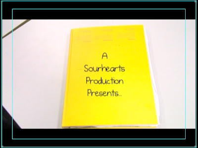
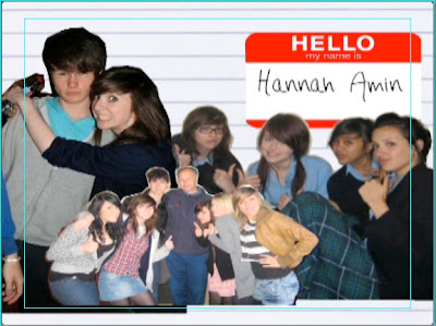
To be honest we don't have any of the preliminary tasks within our film opening because of the structure we've used.
If the film was continued, surely these tasks would be present.
The reason why these rules aren't present in our opening because, the nature of our opening doesn't need them; for example, we go from animated scrapbook, to the birds eye view of the map, to the profile pages of the stereotypes, and then to the live footage which is just a stationary shot (long/ midshot/ close up). It ends with the book closing, to show that we are not inside the diary anymore.
However, it is continuity task because it starts with the book opening and then ends with the book closing.


Wednesday, 4 November 2009

Creative Risks

Risk: We could've potentially offended people with the stereotypes. 
Cost: People wouldn't appreciate the film opening because it's offensive. 
Benefit: The stereotypes were extreme and exaggerated, so hopefully it's more comical than offense/serious.

Risk: The costumes weren't specific.
Cost: The group footage could've looked really bad because the outfits clashed/didn't work. 
Benefit: The outfits really worked because the outline was really basic but we talked it over during lessons and facebook/text etc. 

Sunday, 1 November 2009

Feedback From Tom H/Louis

I really appreciate the criticism from tom and louis especially because everything they said was true.
The reason why the stills aren't long enough for people to read, is because there needs to be a voice over, explaining the groups.
We just needed the visuals of a scrapbook; we rushed our rough cut, to produce something on time.

Because the stills only take up half of the screen, we'll take a screen shot of the opening frame of the motion visuals, edit it into the other side of the screen and then cross dissolve them to get the transitions.

We have all of the titles, we just need to finish the project to put them on.