 The Title of the Film.
 The title of our film is displayed in the first frame. It is produced on lined paper, just like the rest of the opening, to keep in relation to the scrapbook atmosphere. 'The Diary of an Undercover' is written in "Hannah's Messy Handwriting" in a blue font colour; 'Stereofake' is written in a bubblegum pink font colour with "Alpha Fridge Magnet". The line up of stereotypes is on the page with doodles on them and slight adjustments to make it look as though they have been drawn over.
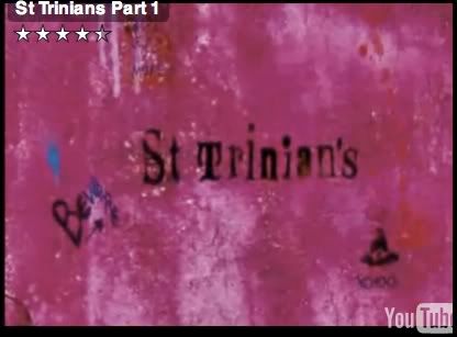
This is fairly common to see this style of titles in "chick flicks" connected with college/school life. For example St Trinians. This has the whole doodle effect; however the doodles and titles are on walls not lined paper.
Mean Girls also has the two colour effect. 'Mean' in white and Girls in pink; this happens with all of their titles.
On the other hand, Angus, Thongs and Perfect Snogging has the same connotation with the girly font, but is displayed to the right of the screen while Georgia is running.
(click on the links to see the frame of the title of the film)
Therefore this genre of film has two different styles of showing the film title on screen.
Setting/Location.
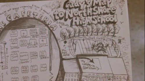
The reason why I've chosen the map as my setting/location shot is because it gives off the whole school/college cliche atmosphere. I could've easily used a live footage scene but they do not give the right feeling, compared to the map. Maps are not very popular in films, therefore it is unusual to see it appear in this film opening. However Mean Girls uses the map to define seating areas and to introduce the groups. Click here to see the map.
Even though we both use this map idea they are presented in two different ways. Ours is much more simple and is created by photoshop. Theirs is hand drawn with the cafeteria and outside area.
Costumes and Props.
Every film has costumes and props, therefore this is a typical media convention. In our frame you can see two 'Emo' girls sitting on a bench. The bench is the prop. Hannah is in a black vest, tights and tutu. Yasmin is in a red&black stripy jumper, black skirt and black tights - that is the costume. Many films from this genre, like us, rely on the costumes and props to separate the characters and to show journeys etc. For example, Cady from Mean Girls.
Camerawork and Editing.
This frame shows the transition between scrapbook and live footage. There is a still on every scrapbook page so that we could edit a smooth transition between scrapbook and live footage.
The reason I chose this as camerawork and editing is because we only used a range of shots, not zooms etc, because we wanted to keep out shots as simple as possible, and not to confuse the viewer. Therefore this shows the camerawork and editing.
Title font and Style.
This frame is from the first part of the title of the film. The title is split into two parts - the diary of an undercover; and, stereofake (with the lineup behind).
The font used is "Hannah's Messy Handwriting" which is used in all of the titles.
Girly/ Journal styled handwriting is a key element in this type of film; as shown above in 'the title of the film'.
Story and how the opening sets it up.
I have used the first shot we see for this frame because it sets the story up. We are shown a book and the camera then enters the book. This sets the story up because it shows we have gone into the book and the following clips are inside the book.
This is more common with fairytales/ disney films.
Genre and How the Opening Suggests it.
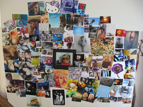
For this frame I have used one of the memory scrapbook pages. It shows a picture of a group at prom and 3 girl (best friends) with a girly banner with a name in it. This shows the genre because most girls have collages or photos on their walls, with all their best memories and friends; so when they look at this they'll think they've seen it at their house or a best friends house.
However wall collages are more for the audience to connect with, not to link to other films.
How Characters are Introduced.
This shows how every character is introduced, but in this frame its just the 'Chavs'. There is a big picture of the main character of the stereotype; followed by a few little pictures surrounding them; the stereotype title in a font that represents that group; and, a little bit about the group filling in the space. On the other page there is a still which the live footage connects to. This is a good way to introduce characters. In St Trinian's they are introduced in a similar way - the head girl takes Annabelle through the dorm and says something about the group and then the shot freezes and the group name appears in a certain font. Chav.
Special FX.
We didn't use any special fx so for this frame I used the transition of Scene kid page to the live footage. I class this as a special fx because we zoomed into the still which then starts moving. We also brightened the live footage.
This is not very common. Special FX is like Star Wars and green screen etc - which is very common in sci-fi/ action films, not "chick flicks" etc.
No comments:
Post a Comment