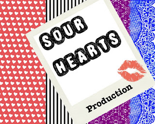
This is my production logo. I got my main inspiration from an Alice in Wonderland, Queen of Hearts, image.
I chose the different stripes because i liked the clashing style, and to represent the variety the production company can offer.
I used a polaroid collaboration, displaying the production company name - "Sour Hearts"; in the font "Truffle-Shuffle", because I liked the edginess of the text, and it is memorable.
The word "production", is in a typewriter font. I don't know why I chose it but I think it's quite effective.
The kiss mark was the final touch. I used the kiss mark, because it relates to the title. It also adds a feminine feel to the overall logo.
I chose the production name from the common phrase "sweethearts". I thought "sweethearts production" sounded too corny, and girly; so i added a twist to add a lot of effectiveness and edginess.
No comments:
Post a Comment